Case Study · Fraser Valley Wellness Coach

Towards Wellness case study

A wellness coach with four published books, 60+ podcast appearances and an eight-module programme — and a website that could not hold any of it. We rebuilt it as a thirteen-page custom-coded site, on a palette taken from her own logo.

The build
13
Pages, built from scratch
Kerisma Vere, coach and author
StackCustom-coded
EngagementFull rebuild
LaunchedAugust 2026
ServingFraser Valley & online
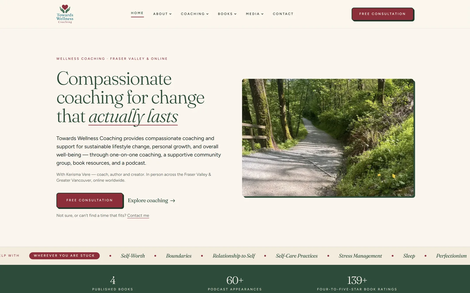
Towards Wellness Coaching website homepage — Fraser Valley wellness coach Kerisma Vere, custom-coded by IshaanEx Digital

Live at towardswellness.ca · Fraser Valley & Greater Vancouver in person · online worldwide

The Towards Wellness story

The business had outgrown the website.

Kerisma Vere coaches in person across the Fraser Valley and Greater Vancouver, and online worldwide. Four published books. More than sixty podcast appearances. An eight-module group programme. None of it had anywhere to live.

Towards Wellness Coaching is a one-person practice built on personal trust. Kerisma works with people on sustainable change — self-worth, boundaries, burnout, perfectionism, the relationship someone has with themselves. Alongside the coaching she writes: four books, a children's title used as a social-emotional learning resource, and a steady stream of articles. She has been a guest on more than sixty podcasts.

The practice had grown faster than the website could keep up with. In her own words, it "has been evolving faster than I have been able to keep up." The old site could not hold the books, the programme, the podcast history or the coaching packages, and it carried a colour she had come to dislike. That is the real brief on a project like this. Not "make it modern" — make it hold everything, and make it sound like her.

Why a practitioner site is a different job. A contractor's website is judged on whether it looks capable. A coach's website is judged on whether it feels like the person you would be sitting across from. Get the tone wrong and the visitor never books, no matter how fast the page loads. So the entire build was organised around one question: does this still sound like Kerisma?

The build: thirteen pages, custom-coded, designed from scratch rather than dropped into a template. Separate homes for one-on-one coaching, the group programme, courses and workshops, the four books, the podcast appearances, her writing, a gallery of her own photographs, and a proper contact page with a working enquiry form that submits without reloading the page. Every page is mobile-first and built so her content has room to breathe instead of being squeezed into a layout that was never designed to hold it.

The colour that was doing all the damage. Her old site was built on a yellow that she had come to associate with everything dated about it. Rather than reach for a mood board, we pulled the new palette out of the logo she already owned — the deep forest green from the hands in her mark, the burgundy from the heart, and a warm ivory to sit them on. Her logo was kept and recoloured, not redrawn. That is why the site feels like hers rather than like a designer's taste: the colours were already her own.

Breathing room without thin writing. Calm, spacious wellness sites are usually calm because there is nothing on them. Kerisma had the opposite problem. So the airiness had to come from information architecture — giving each idea its own page and its own section — rather than from cutting her substance. It is the harder version of the brief, and it is the version that also gives search engines something to rank.

What we are not going to tell you. This site launched in August 2026. There are no ranking positions, traffic charts or lead numbers yet, and we are not going to invent any. When there is real data we will publish it here, the same way we do on every other case study on this site.

How it was built

We do not copy a website we like. We measure it.

Every design decision on this project traces back to something measured, not something guessed. That is the whole method, and it is why the spacing holds together on a thirteen-page site built by one person.

Step one

The client picks the references

Kerisma sent sites she responded to before we designed anything. That is the step most rebuilds skip, and it is the cheapest possible way to find out which register a client actually wants. Both of hers were green. That is why the site is green.

Step two

Measure the reference, do not trace it

We render a reference page in a real browser and read the styling the browser actually computes — the type scale, the spacing scale, the corner radii, the shadows. What comes back is a set of numbers, not a screenshot to copy.

Step three

Keep the maths, replace the brand

The proportions carry over. Every colour is overwritten with the client's own, and every word is the client's own. What survives is the rhythm of the layout, which is the part that is genuinely hard to get right by eye.

Step four

Build only from the scale

Every button, card and section draws its padding from one spacing scale instead of a fresh judgement call. Decide spacing forty separate times and you get forty slightly different answers. Read it from one scale and the page cannot disagree with itself.

It is the same method behind our website design work generally, and the Abbotsford web design page explains how it applies to local businesses closer to home.

In the client's words

The only review that counts on a rebuild.

Towards Wellness Coaching has been evolving faster than I have been able to keep up so I got some help from IshaanEx Digital to help me create a new version of the website. I can not speak highly enough of the work Harman did in putting all of this together in a way that really captures the heart of TWC.

Towards Wellness Coaching logo
Kerisma Vere
Coach and author, Towards Wellness Coaching
Posted publicly on Facebook, August 2026

That line is the one that matters on a practitioner rebuild. Nobody who runs a coaching, counselling or clinical practice worries that a new website will be too slow. They worry it will stop sounding like them. If you run a practice and that is the thing holding you back, the website design page covers how the process works, or you can read the rest of our client case studies or who you would be working with.

Has your practice outgrown your website?

Send me the site you have now and the one you wish you had. I will tell you honestly whether it needs a rebuild or just a tidy-up, and what it would take. No commitment.