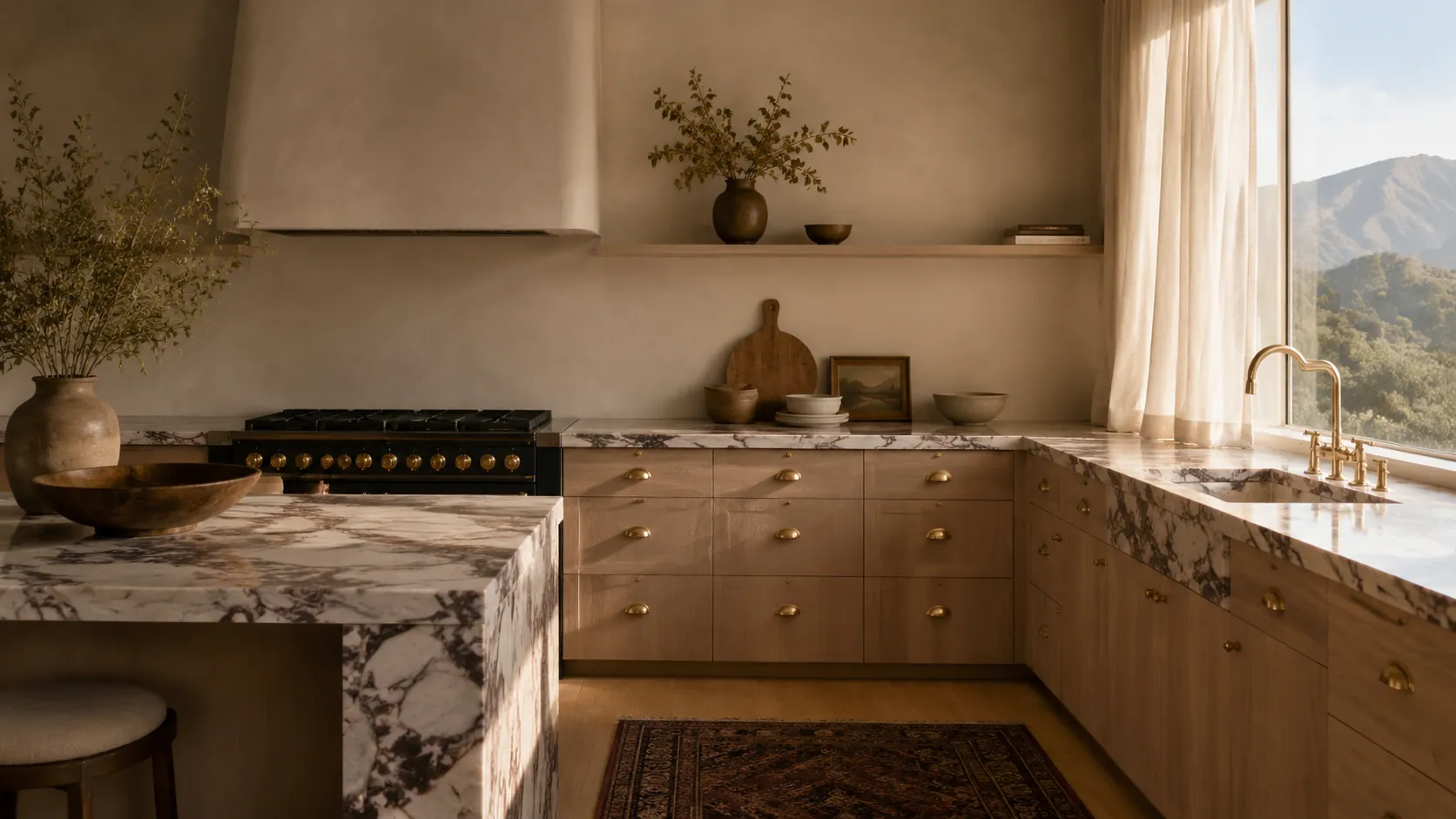
A small Burnaby renovation studio styled like an architectural editorial. Cream paper canvas, ink display type, one cordovan italic accent per heading. Hero video loop, before-and-after scrubber, sticky-stacking project cards. Premium residential design-and-build under one roof, written like a magazine caption — never a sales close.
Most BC renovation sites split into two camps. Either the contractor-flyer template with stock kitchen photos and a "Get a Free Quote" pop-up, or the design-firm portfolio that shows beautiful work but reads cold and corporate. Atelier Northwest walks the third path — a small design-and-build studio written like a magazine caption. Considered, plain English, never aspirational.
The signature is restraint. A cream paper canvas, ink display type, one cordovan italic accent per heading, and three signature motions — hero video loop, before-after scroll scrubber, sticky-stacking project cards. Nothing else animates. The result reads like an architectural editorial spread, not a renovation brochure.
High-ticket residential renovation studios across BC — design-build firms, custom home builders, kitchen-and-bath specialists charging $80K-$1.2M+ per project. Studios that already do publication-grade work but ship templated, contractor-style websites. The buyer is the studio principal who wants their site to read like Architectural Digest, not a Yelp listing.
High-ticket renovation is one of the highest-value local search categories in BC, and one of the most templated. A studio charging $80K-$180K for a kitchen needs a site that signals premium-craft without reading luxury-cliche. This concept shows what that looks like.
Editorial palette built from cream paper #EFE7D6 + ink #141414 + a single cordovan accent #6B2C2C. No purple, no Tailwind blue, no greens. The cream is the brand — every section sits on it.
One italic accent per heading rule — Instrument Serif italic in cordovan, used exactly once per display headline. The italic phrase is the editorial pivot, never decoration.
Three signature motions only — the hero video loop (steam, curtain breeze, light shift inside an empty kitchen), the before-after scroll scrubber on the signature project, and sticky-stacking project cards on the projects band. Nothing else animates.
Bricolage Grotesque 700/800 for display, tight tracking -0.02em, leading 0.92-0.96. Inter 400/500 for body. Eyebrows at 12px UPPERCASE with 0.18em letter-spacing.
No people, no faces in any imagery — the work is the photography. Hero video shows an empty kitchen with steam rising from a kettle. Project cards show finished rooms and B&W in-progress shots, never humans.
Every project, testimonial, credential, and award labelled 'Sample' so the concept can never be mistaken for a real Burnaby studio's portfolio.
Phone number set tabular-numeral as 604 · 555 · 0100, separated with middle dots — reads like a card on a fridge, not a marketing CTA.
Banned vocabulary enforced — no 'luxury', no 'transform', no 'dream kitchen', no 'open concept' (preferred replacement: 'the wall came down'). Magazine voice, not contractor-flyer voice.

Vanilla HTML + hand-written CSS (single 900-line file) + lightweight JS for the before-after scrubber, mobile nav, and theme toggle. Fraunces + Inter via Google Fonts. Iconify for hairline icons. Hero video re-encoded H.264 CRF 28 silent at 735 KB. Every PNG converted to WebP at quality 80. Total page weight under 2.4 MB. No analytics, no tracking, no third-party embeds — the site is the work.
A concept site isn’t the finish line — it’s the starting frame. These are the real-client shifts we’d make on day one of a paid engagement.
Custom-coded for speed, WordPress or Wix if that fits better. We meet you where you are.
Or call 250-271-7055 — sometimes it’s faster to just talk.